Millions of employees face challenges with financial literacy and decision-making, often resulting in poor financial outcomes. According to the PwC Employee Financial Wellness Survey, over 72% of employees reported feeling stressed about money, yet most companies fall short in providing the support they need. This financial stress directly impacts workplace productivity, leading to preventable losses for employers.
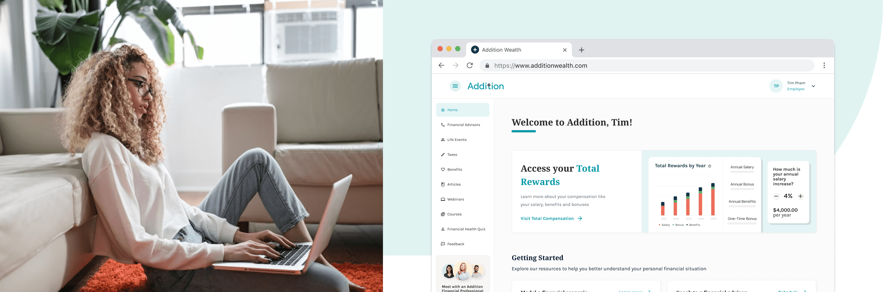
As the Founding Product Designer, I was responsible for helping Addition financial wellness platform build from zero to one, supporting design through Seed to Series B ARR ($5M+).
Wearing many hats, I drove UX/UI, customer research, product strategy, branding, and front-end development. During my time here, I worked directly with leadership, engineering, product, and GTM to build our product used by thousands of employees nationwide.
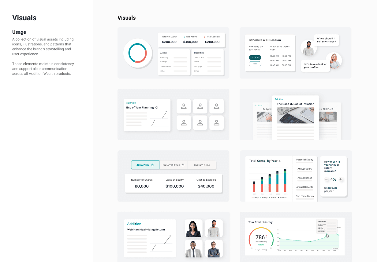
major feature launches
unique users onboarded
average monthly CSAT score
annual recurring revenue


What were our user pain points?
Users want to understand their individual, unique financial situation.
Users want to receive clear, personalized guidance.
Users want to measure their progress over time.
What were our business challenges?
Low engagement limits user adoption.
Lack of personalization reduces relevance and trust in the product.
Inconsistent user experience weakens product cohesion and user confidence.
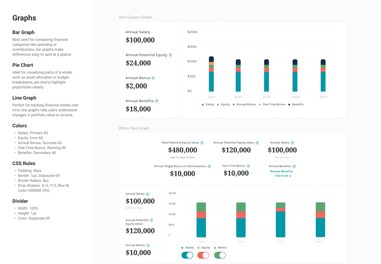
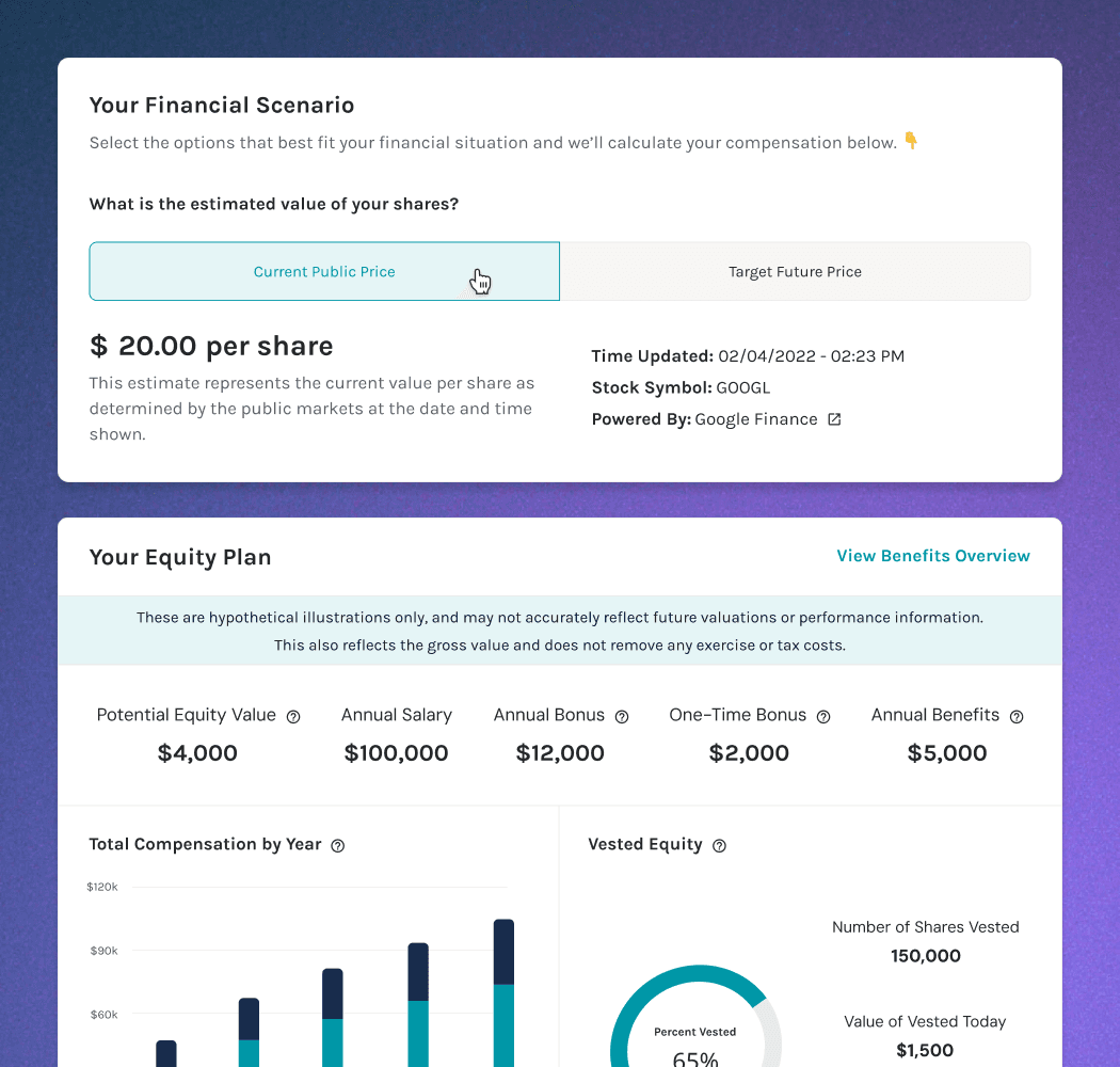
Equity is one of the most valuable (and most misunderstood) parts of a compensation package. Most employees either ignore it or accept it without understanding what they're actually agreeing to. This included me when I started this project.
I had no domain knowledge on equity going in. So I treated that as an advantage. I researched until I had a working knowledge base, then went directly to Addition's financial advisors and users to test what I'd learned. The gap between what I assumed and what users actually needed became the design brief.
One moment that changed everything: learning how vesting cliffs work. I'd always assumed equity was like a salary – you earn it continuously. The reality is more nuanced, and users were making decisions without understanding the timing implications. I added contextual elements to surface that information at the exact moment users needed it, without overwhelming people who just wanted a simple number.
It felt like being a tutor who'd just learned the subject themselves. That proximity to the user's confusion made the tool better.
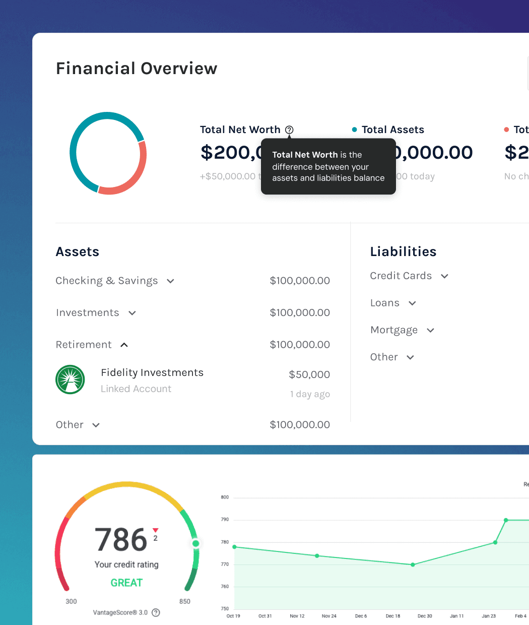
The insight that drove this feature came from a customer interview that stuck with me: a user didn't know how much money was in their checking account. They weren't irresponsible, they were just caught up by real life. Multiple accounts across multiple institutions, no single place to see the full picture. That was the real problem – not that people lacked financial knowledge, but that they lacked financial visibility.
The technical reality was also difficult. Banking, investment, and retirement data all come from different providers with stubborn, inconsistent APIs. There was no out-of-the-box solution. We stitched it together, and my job was to make that complexity invisible to the user and presenting a comprehensive view that felt simple even though the infrastructure underneath was anything but.
Once accounts were connected, the design priority shifted to scannability. Users didn't need to analyze their finances – they needed to feel oriented. Net worth at a glance, cash flow patterns visible without digging. The goal was to answer the question users didn't know how to ask: where am I, right now?
One pattern kept surfacing in user interviews: when people started talking about their finances, they'd spiral. No retirement savings would lead to crippling debt would lead to no emergency fund – one anxiety cascading into the next. Sessions with financial advisors suffered for the same reason. The problem was too unspecific to solve and you can't help someone who's overwhelmed by everything at once.
The insight was simple but counterintuitive: users who were guided to focus on one problem, specifically the most time-sensitive one, made more progress and reported better financial outlooks. Focus wasn't a limitation. It was the unlock.
It became our highest-traffic feature for a practical reason: it was the easiest entry point into a complex product suite. New users didn't have to figure out where to start– the life event did that for them. Lowering that barrier turned what could have been an overwhelming platform into something that felt immediately useful on day one.

The brief was almost impossible on paper: teach people concepts they'd spent their whole lives avoiding, in a format they'd always found boring, in a product they opened twice a month.
The existing resource library wasn't working. Articles full of jargon, webinars that felt like homework. User research confirmed what we already suspected – people don't learn finance by reading about it. They learn by seeing it and connecting it to their own numbers.
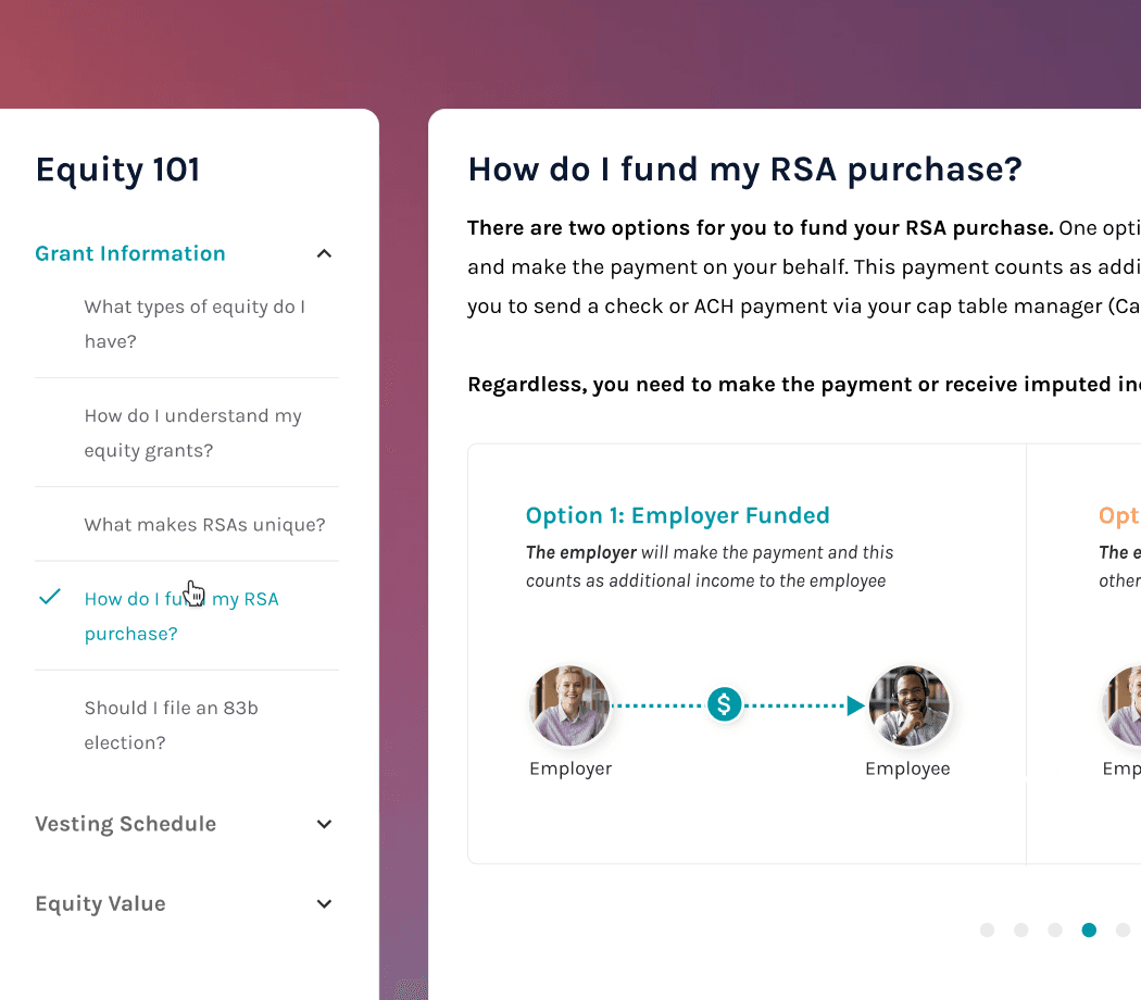
So I designed an interactive course format across 15+ financial topics. The personalization was the differentiator – once a user linked their accounts, courses stopped using hypothetical examples and started using their actual numbers. In the equity 101 course, the 'how to calculate your equity value' equation pulled your real strike price and share count. Abstract concept became personal reality.
That became the template for the whole course system: let the financial experts define what's accurate, then fight for what's actually learnable.
As Addition expanded into the enterprise market, I led design for three major partnerships – Balance Wellbeing, Edward Jones at Work, and AARP – extending our platform's reach to millions of users outside our original audience. Each partnership came with its own legal, brand, and compliance requirements. What made it tractable was the design system I'd built for the core product – modular enough to refit for entirely different brands and user groups without starting from scratch. What made it hard was everything else.